Who Burnt All The Carbon?
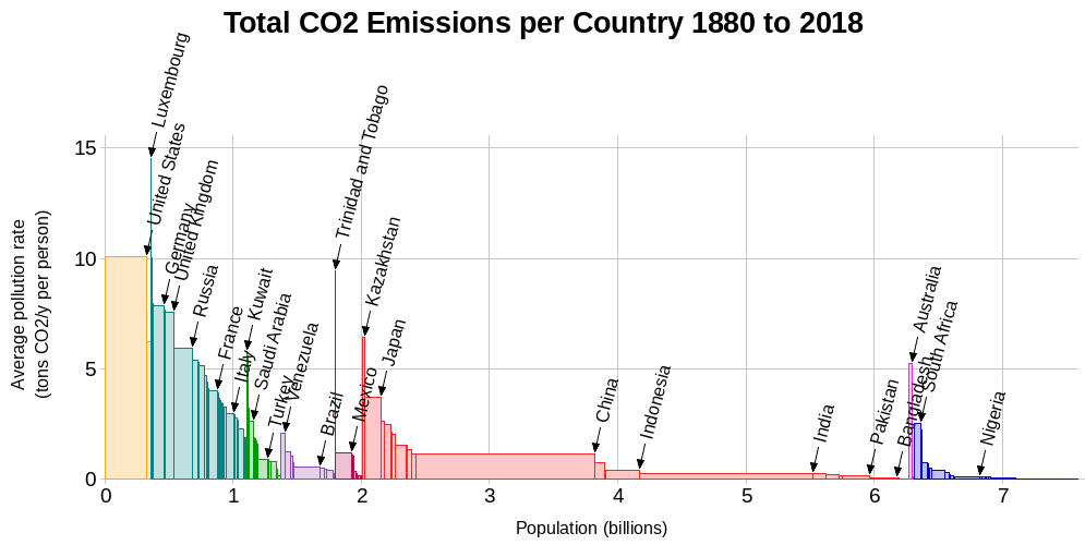
On page 14 of his excellent book Sustainable Energy - Without the Hot Air, David MacKay included a chart showing each country's cumulative emissions of CO₂ since 1880. I've updated the chart for the period 1880 to 2018:
If we ignore tiny countries, the UK is in third place after the USA and Germany.
When the Industrial Revolution started, the amount of carbon sitting in coal under Britain was roughly the same as the amount sitting in oil under Saudi Arabia.
The UK has released the 5th most CO₂ into the atmosphere over history of any country! despite being home to less than 1% of the world's population. The top 10 total emitters over history are:
| Country | Fraction of Total Historical CO₂ Emissions | Fraction of World Population | |
|---|---|---|---|
| 1. | United States | 27.4% | 4.3% |
| 2. | China | 13.3% | 18.4% |
| 3. | Russia | 7.1% | 1.9% |
| 4. | Germany | 5.4% | 1.1% |
| 5. | United Kingdom | 4.2% | 0.9% |
| 6. | Japan | 3.9% | 1.7% |
| 7. | India | 3.2% | 17.8% |
| 8. | France | 2.2% | 0.9% |
| 9. | Ukraine | 2.0% | 0.6% |
| 10. | Canada | 1.9% | 0.5% |
An obvious consequence of this knowledge is: Before we start suggesting with a straight face that people in poorer countries need to be cutting their carbon emissions, we have an obligation to use some of our wealth (partly earned by burning massive amounts of fossil fuels) to remove from the atmosphere most of the CO₂ we've already liberated.
Original Chart
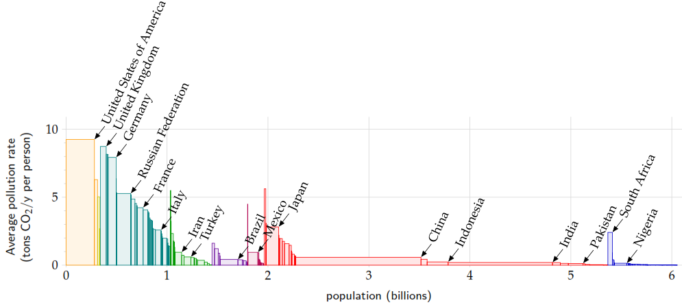
David MacKay's original chart shows each country's cumulative emissions of CO₂ from 1880 to 2004:
The 2018 chart shows that the USA has powered ahead with even more fossil fuel emissions, while the UK has dropped from 2nd to 3rd place amongst the larger nations, as the UK's (territorial) emissions have been falling since 1970. Equally, this change may be a result of improvements in the historical estimates.
Latest Emissions Data
To find out who's been burning all the carbon in recent years, please see Who's Burning All The Carbon?
Sources and Notes
- Historical emissions from https://www.wri.org/insights/history-carbon-dioxide-emissions
- Populations from https://databank.worldbank.org/reports.aspx?source=2&series=SP.POP.TOTL
- I've included some smaller countries eg Luxembourg which David MacKay omitted.
- I've omitted Aruba as its cumulative emissions at 25tCO₂ per head per year would have broken the chart.
- These charts report only CO₂ emissions. Historical estimates of other greenhouse gases are not reliably available.
- Similarly, these charts report only territorial emissions, and take no account of CO₂ produced manufacturing goods for export - see The UK's True Carbon Emissions
Back to Arctic Death Spiral | About | Sitemap
Twitter: @ArcticDthSpiral | Instagram: @ArcticDeathSpiral

